

Checkout
Case Study
UX | UI Project
Background
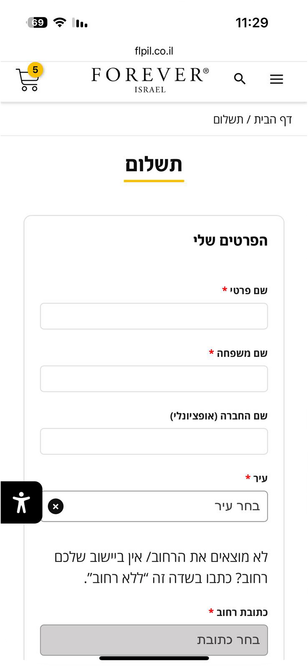
Forever Israel's checkout page was designed as a long one-pager with many text fields. On mobile, that meant endless scrolling just to fill in details or review the cart. Recordings showed that customers had to jump back and forth within the page to verify their details. Another weak point was the option to become a Forever Preferred Customer (FPC) and receive a 5% discount, it directed users to different page outside the checkout process.
I knew there was room to make this process clearer, faster, and more engaging, especially on mobile, which about 80% of the site's visitors use as their preferred device.
Here is a look at the old checkout design:


Exploring Possible Solutions
I considered two main approaches to improve the experience. I researched both and summarized their pros and cons:
Multi-Step Checkout
Pros:
-
Guided, less overwhelming experience: Users face only a few fields at a time, reducing cognitive load. Visual progress indicators help reassure them.
-
Improved analytics: Easier to pinpoint exactly where drop-offs occur.
-
Greater perceived security and clarity: Step-by-step flow makes complex purchases feel more trustworthy and helps users double-check details.
Cons:
-
Slower and potentially frustrating flow: More clicks and page loads introduce friction and can increase abandonment.
-
Editing is a pain: Going back to fix a mistake means navigating through multiple pages.
-
Higher bounce risk: Each additional step is another opportunity for users to drop off.
Section-Based Checkout
Pros:
-
Streamlined, faster process: Everything appears on one screen, reducing steps and load times.
-
Clear overview and instant validation: Users can quickly review all fields and spot mistakes more easily, including items in the cart and total price.
-
Higher conversion potential: Simplicity encourages impulse or repeat purchases.
Cons:
-
Risk of information overload: Too many visible fields can overwhelm users, particularly first-timers.
-
Limited funnel insights: Harder to track where users drop off or which sections cause friction.
My Chosen Approach
I decided to go with the section-based design with pop-ups. This way, the main page stays compact and easy to scan, while each section opens only when needed. Customers don’t have to scroll endlessly, and all the information they’ve entered remains visible in one clear layout.
One challenge was how to integrate the FPC discount option into the checkout flow without redirecting users to another page. In the next section, I explain how I addressed this in the UX design.
UX Decisions
My guiding goals for the UX design were:
-
Increase user confidence throughout the process.
-
Keep the screen as light as possible to reduce cognitive load.
-
Encourage more users to sign up as Preferred Customers.
First, I defined the checkout sections to keep each pop-ups light and the main screen as informative as possible: Email, Payment & Shipping Details, Shipping Method and Referring Distrobuter (a unique section for FOREVER).
I also moved the cart products from the bottom of the screen (displayed vertically) to the top (displayed horizontaly). This saves space and ensures the first thing customers see are the products they’re about to purchase.
Below the pop up sections, I placed the Preferred Custmer toggle next to the total price.
This ensures that when users activate the FPC option, they instantly see the discounted price update.
UI Decisions
My guiding goals for the UI design were:
-
Design for mobile-first: Clean, minimal layout with clear hierarchy.
-
Style the FPC toggle so it stand out but remain non-intrusive.
-
Align with the Forever Living Products brand identity.
To achieve these goals, I replaced the old text fields with Material Design input fields. These are more familiar to users, visually cleaner, and more space-efficient, as shown below:
Before

After

The First Folding Screen
I removed the cart, search and menu icons from the top bar to keep the users focused on the checkout flow. Below that I placed the purchase item details, which were not visible in the old checkout. All checkout sections are now visible within the first fold of the screen, whereas in the old design, only a few text fields appeared at first glance.
Before
After

The Checkout Process
Here's how the checkout process looks once all text fields are filled, comparing the old and new designs. In the new version, the customer data is more organized, easier to scan, and visually clearer.
Before

After

Joining as Preferred Customer
One of the biggest weaknesses of the old checkout was the low conversion rate of customers becoming preferred customers. The company marked it as very high priority goal, but the precentage of users joining through checkout remained low.
Some of the main reasons were:
-
The "Join" button didn't stand out enough to encourage clicks.
-
The button redirected to a separate sign-up page where most details had to be re-entered. This interruption caused many users to abandon the process.
Becoming a Preferred Customer instantly provides a 5% discount. requiring only one extra detail, the customer’s ID, since most other information is already entered during checkout.
In the new design I added a toggle switch next to the purchase price section. While switched on, the price updates instantly with the 5% discount, and an ID field appears below. To emphasize the connection between the discount and the ID field, both elements share the same color as the toggle’s “on” state.
Before

After

The New Checkout Design


